Analysing Existing Products
|
Poster One
|
Poster Two
|
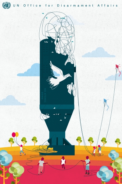
Poster 1
I chose this poster because of how it tells a story and makes its point of nuclear disarmament from multiple perspectives. I like how the use of shape and colour all point to the message of a brighter and happier time without nuclear weapons. I also like how the poster maintains simplicity while adding in more complex details when telling the story of a community together taking away the weapon. The work conveys the message clearly which can be seen throughout the poster presented in different ways. The hierarchy in this poster is clear and points the viewer in the direction of the focal point and the message. The way the poster is constructed as a story of people coming together to unravel nuclear weapons makes the viewer want to look for longer and see what is happening in the rest of the poster. The nuclear weapon stands out the most followed by the peace dove. The way the artist has used perspective means that the nuclear weapon reaches high into the sky and guides the eye up to "UN Office For Disarmament Affairs". People can be seen below the weapon unravelling it which again allows the message to manifest but it isn't the first thing the viewer sees. The use of bright colours indicates how the implementation of this would create a happier/brighter time. The poster uses very little typography and conveys it's message through it's imagery. Because all aspects of the poster are used to project the main idea, changing one aspect changes the whole feel of the product. For example if the sky was changed to a darker colour it would retract from the light and peaceful message. This affects the rest of the poster and makes the ways that the other aspects emit the idea less effective. The way the poster was constructed means that all the aspects kind of feed off each other to create a magnified intimation, meaning that a change to the structure of the design disrupts the message.
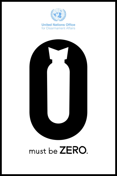
Poster 2
I chose this poster for the same reason I think many people would like it, because it's cleverness is easy to understand. The recognition of this cleverness in people causes them to almost pat themselves on the back and take more interest in the product. I like the simple and bold message that the poster emanates when viewed. I like how the poster uses shape to create layers of the message all at once and how the designer has used a border to frame the work. Because the message is so simple and bold it is especially clear to the viewer what it is. Because the poster is so simple and has few aspects it is easy to view the hierarchy. The most prominent aspect and the focal point of the poster is the 0 with the shape of a bomb superimposed in the centre.
Identify And Prioritise Research
moist
